DeLonghi Coffee machine Redesign

Collaborated with:
Presented at:
TU Delft Product Usability and UX Assessment in Design Course, June 2020
Summary
DeLonghi PrimmaDonna Elite is a high-end coffee machine with 95 percent of its use in the home context.
We start with analyzing the product and defining a design goal for the target user group.
We redesign the app, the machine, and the display to conduct usability tests with various assessment methods; then we present the final redesign strategy that achieves the design goal and improves the usability of the machine.
Keywords
Redesign, coffee machine, usability testing, product, app
Skills
Usability Testing, Persona, Storyboard, Concept test, Questionnaires, Interviews
Team
Nuria Nicolau, Martine van der Veen, Sueyoon Lee, Aron Vink, Laura Ruijs
DeLonghi PrimaDonna
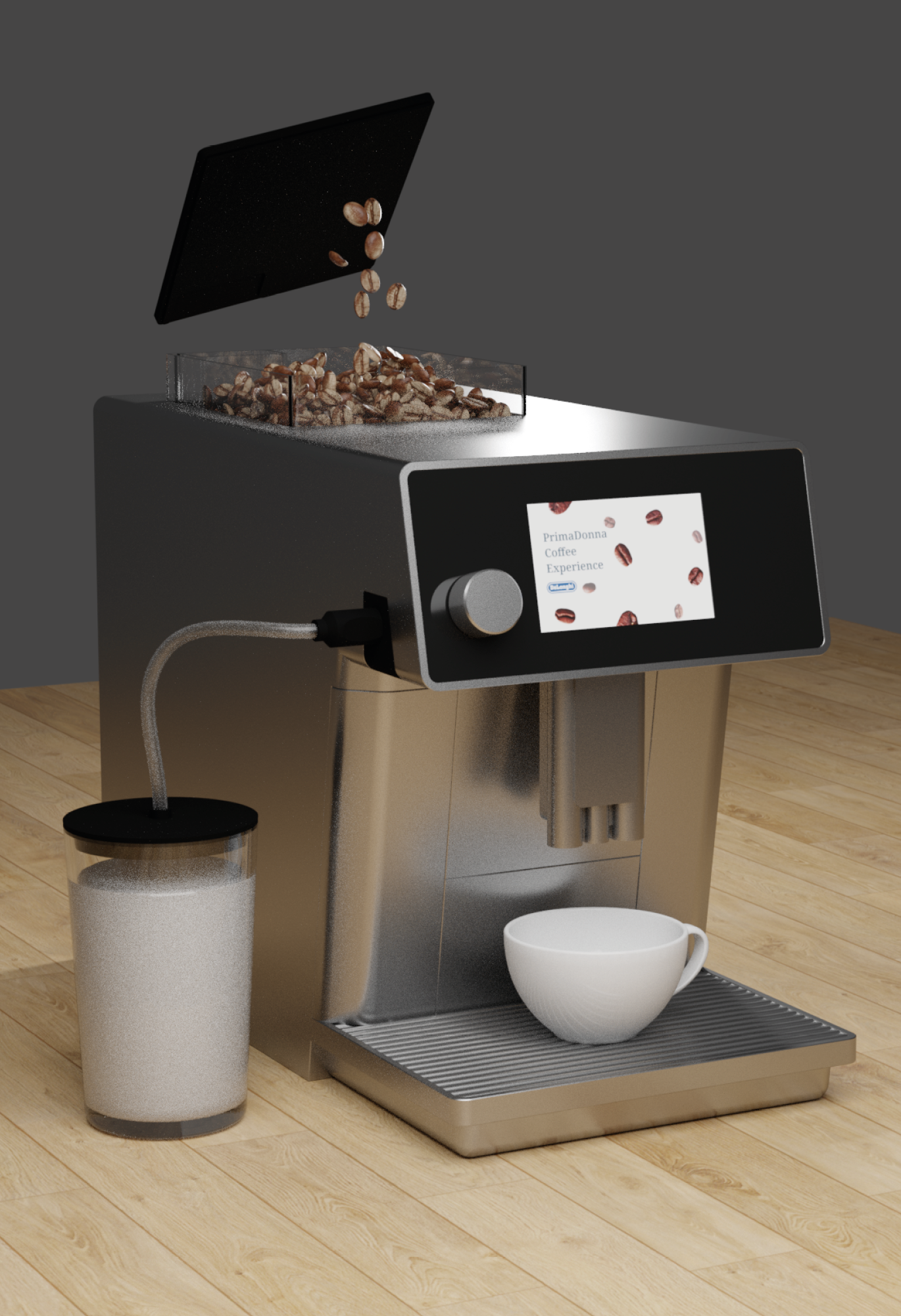
De'Longhi PrimaDonna Elite is an automatic espresso machine that supports personalized beverages and comes with the app. The machine costs 1799 euros, and 95 percent is used in a home context.
Our target is mid-high class people in their 30s-50s who have intermediate knowledge and interest in coffee. We created a persona who has a family with three children and a wife. He drinks a morning espresso and weekend cappuccino.
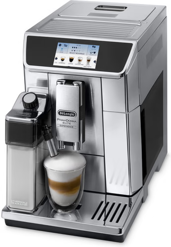
PrimmaDonna Elite

Persona

Market analysis
Product Quality Analysis
We analyzed the current model by scrutinizing build-up parts, drawing flow charts for use cases, and a storyboard for user scenarios.
The unpacking and the first-use experience of both the machine and app were recorded. Additionally, we followed a cognitive jog-through process to find insights on usability by asking participants to achieve five goals.
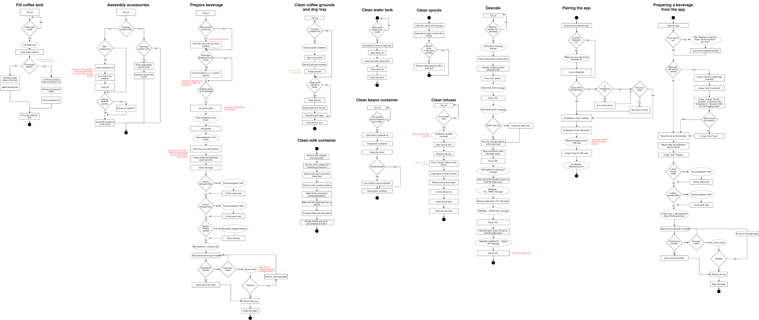
Use case flow chart
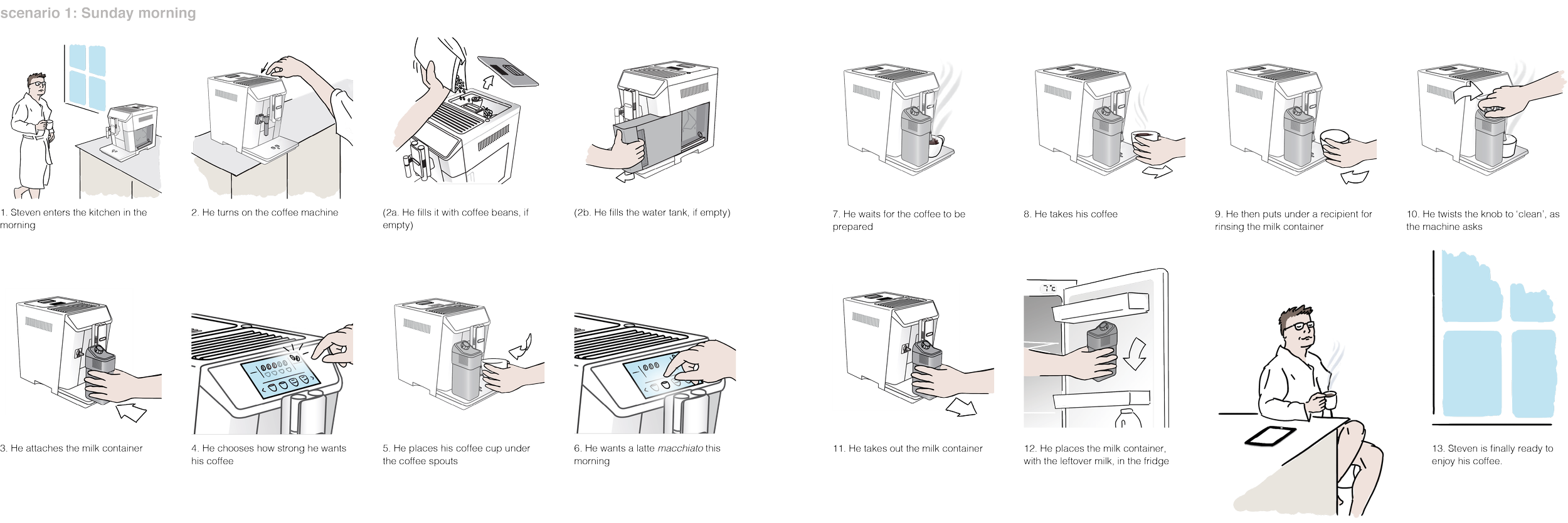
Story board scenario
Design Goal
Our redesign goal is to make our target user feels in control, and satisfied with the beverage-making process - as if he is a barista. It involves designing a consistent interface across the app and machine display to guarantee efficient and intuitive use. Also, we defined six testable targets that cover the issues found in the product analysis so that we can validate if the redesign has achieved the goal .
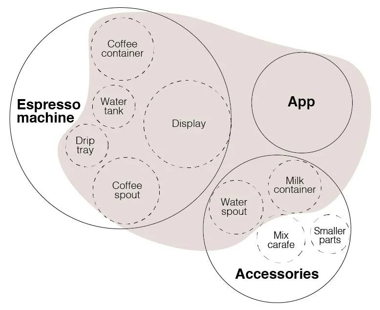
Scope of the project

Six testable targets
Three Concepts
We brainstormed and derived three coffee machine redesigning ideas that match our design goal and target group.
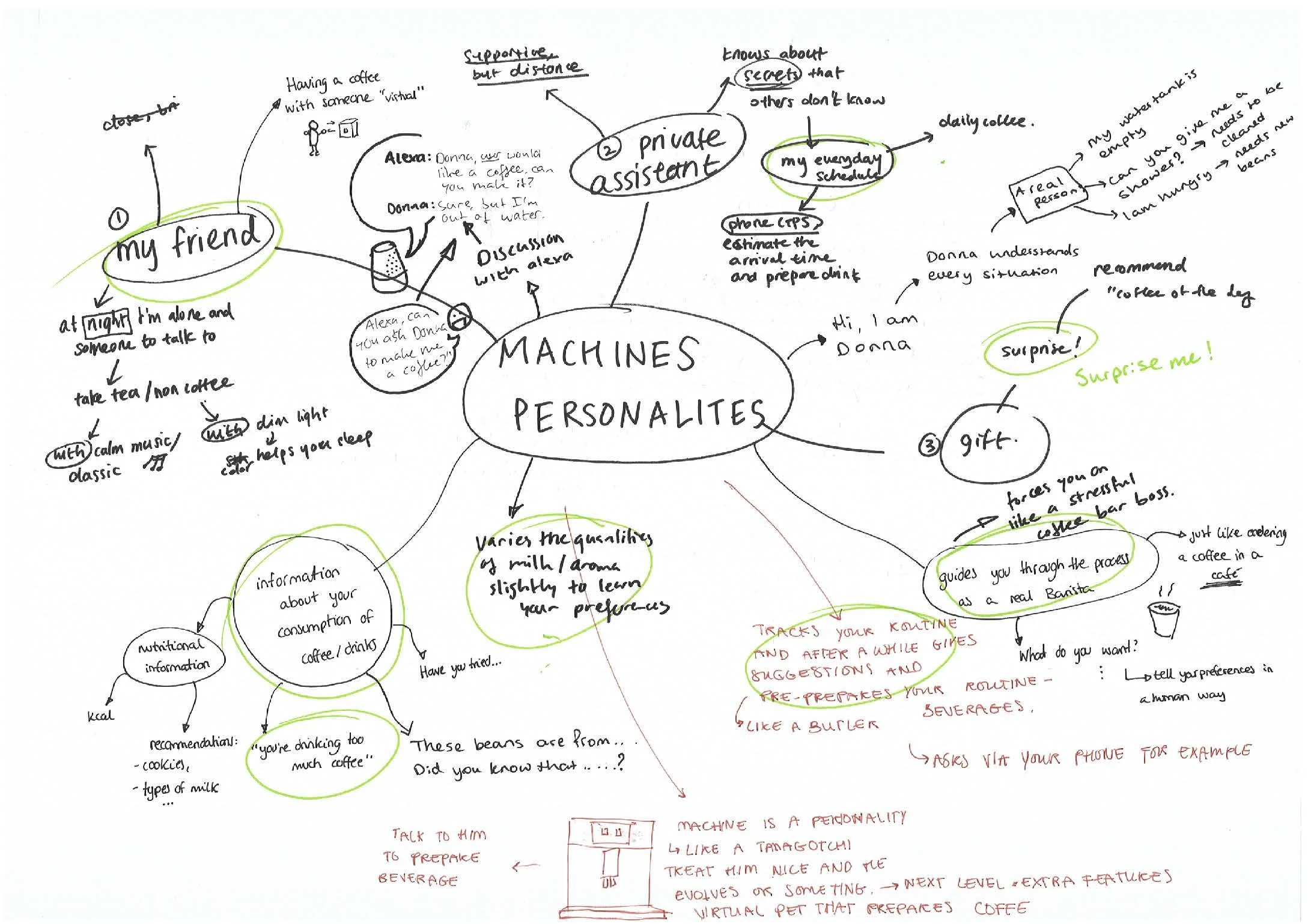
Concept 1:
“Virtual Barista” (App and Voice control)
Users can make coffee from a distance with a voice or app. They can either make a pre-set beverage with a single command or make a new receipe through a friendly conversation with the machine.

Concept 1
Concept 2:
“Feeling like a barista” (Detailed personalization)
Users can feel like a barista while operating the machine by adjusting the spout and cup's position. The app supports precision settings for detailed personalization and provides information about coffee, tips, etc.
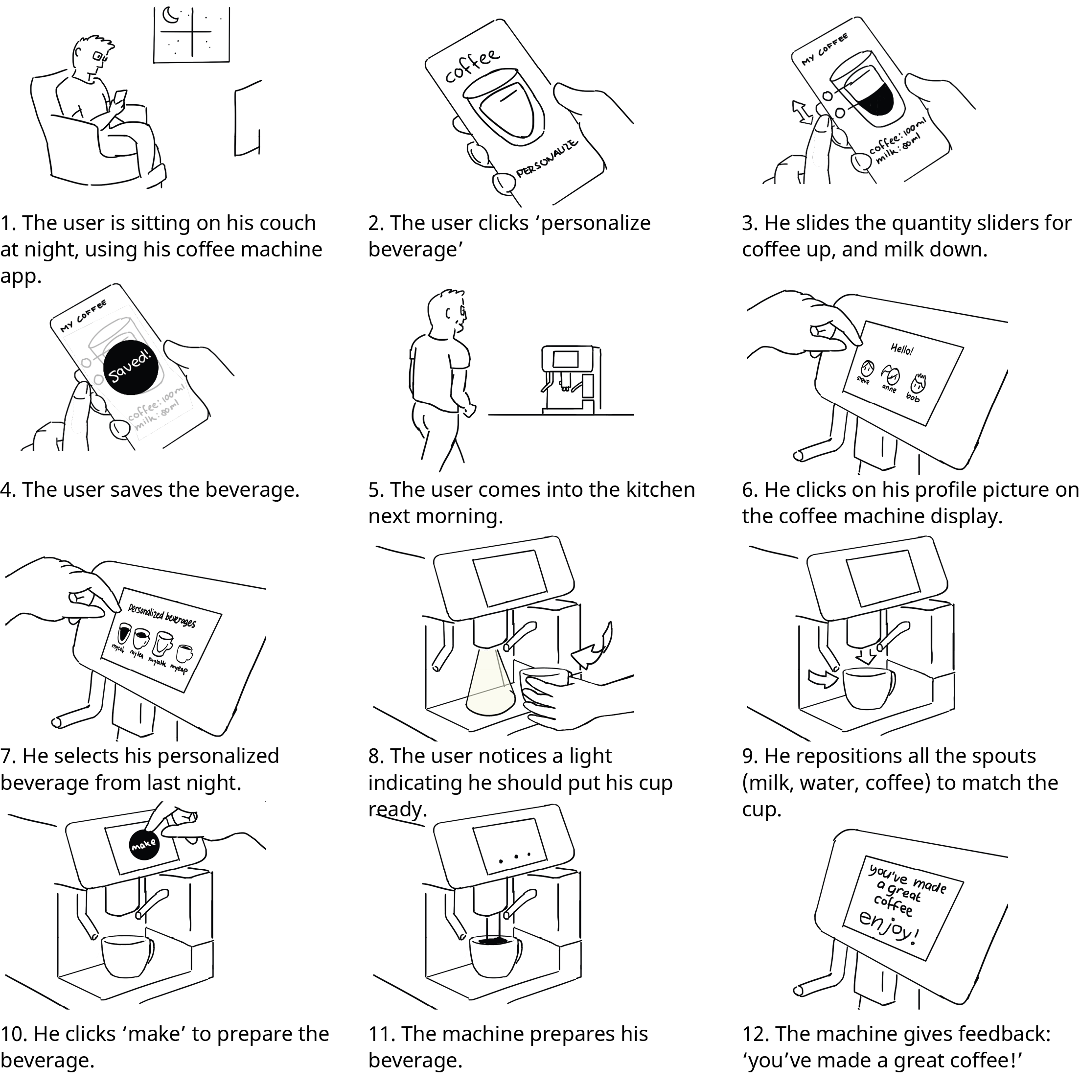
Concept 2
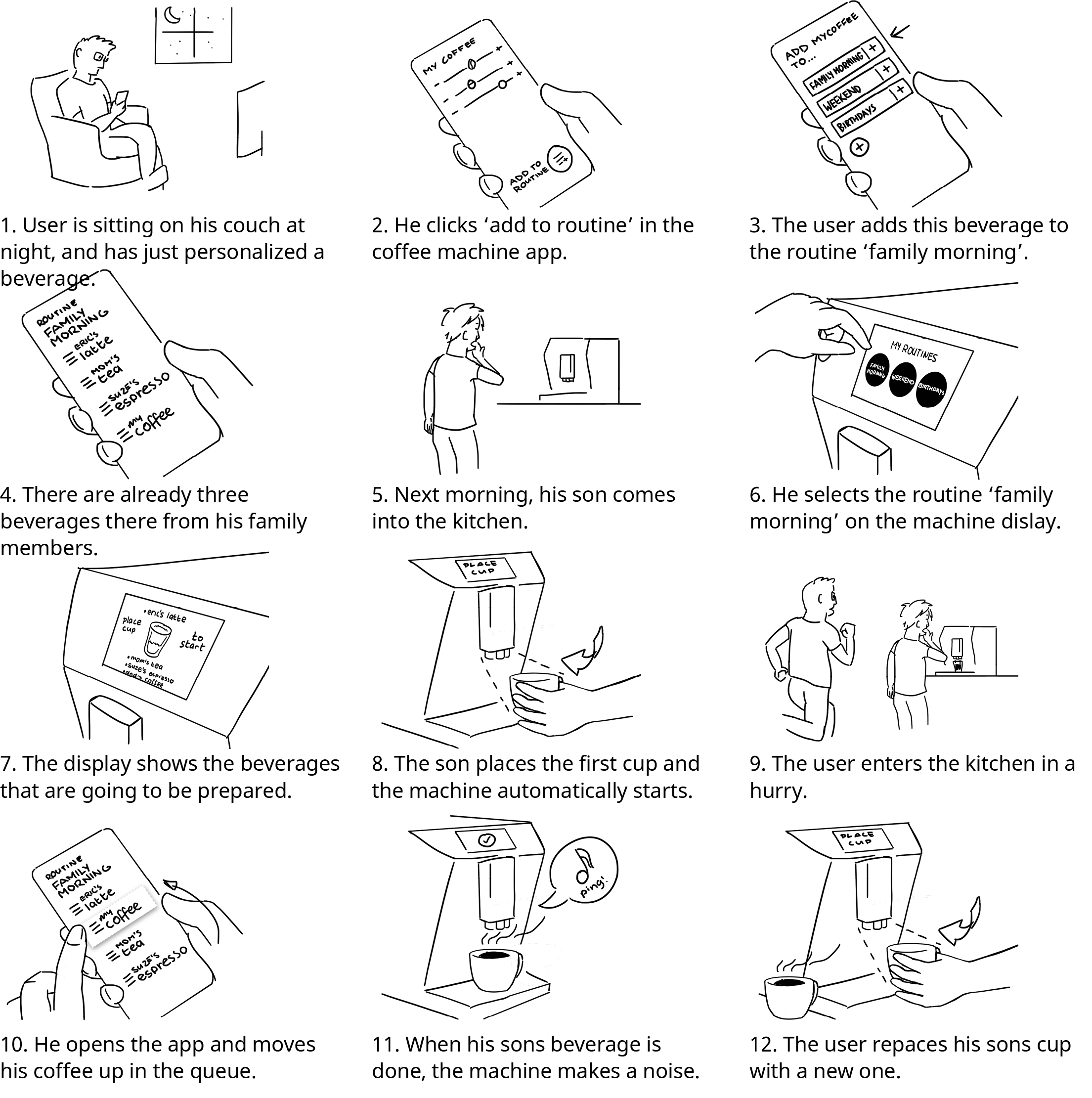
Concept 3:
“Playlists” (Daily scenarios)
Users can set a “coffee routine list” for different situations - for example, Sunday morning, and weekly expresso. The "coffee list" can be edited through an app or directly on the machine interface by multiple users.
Concept 3
Concept Evaluation
We built prototypes (app, machine, display) of each concept and conducted a concept test to evaluate features and help us make a choice between the three.
Participants were given a contextual scenario and tasks to complete with prototypes. We also shared storyboards at the end and asked for their opinion on the concept.
After reviewing the video and interview, we visualized the strength and weaknesses of the three concepts using Harris profile method. We put different weights on four qualities - ‘feeling in control’, ‘intuition’, ‘efficiency’, and ‘personal connection’ to evaluate three concepts.

App prototype for concept test

Test with prototype

Harris profile analysis
Redesign
Based on the evaluation, we chose concept 2 as the main strategy while incorporating relevant design elements from the other two concepts: "Detailed personalization - Feeling like a barista". We also took into account the priority in three levels (main functions, secondary functions, details) for all 'app', 'machine' and 'display'.

Priotity for each parts
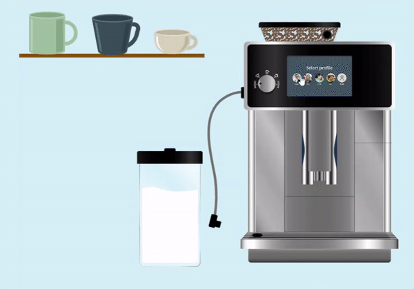
Machine: We redesigned the milk accessory, integrated spouts, foam dial, and milk tube cleaning strategy for improving usability. The position of the coffee bean container and foal dial were newly designed for a barista feeling.

App: The flow of Wifi pairing process and creating a new beverage were improved for better usability. New features (queue, cup detector, etc) were added and UI was refined.

Display: UI and flow were redesigned to match the app, and the profile selection screen was added for a personalized experience.

Usability Test
Due to Covid, not all the participants could test the prototype in person; thus, both app and machine prototypes had to be built digitally to guarantee consistency and accessibility, even with its limitations.
The tests started with basic questionnaires (personal, coffee habits), and participants were each given situations and tasks to complete. After the test, they rated satisfaction and difficulty levels for each task, followed by a semi-structured interview.
Machine and display prototype (Adobe XD)

Analysis
We analyzed raw data by recording user behavior from the video and writing comments on the spreadsheet. Then, we used ‘source-of-error analysis’ to find the actual usability problems of the current design. Each usability problem was rated on a 3-point severity scale (Critical, Serious, Cosmetic) to prioritize the issue.
SUS Score (System Usability Score) and Satisfaction/Difficulty Level were calculated for each scenario and task. The usability scores for the target group and secondary group were also compared to see if we achieved the design goals.
Finally, we revisited the testable targets - six statements defined in the beginning - to validate the redesign.
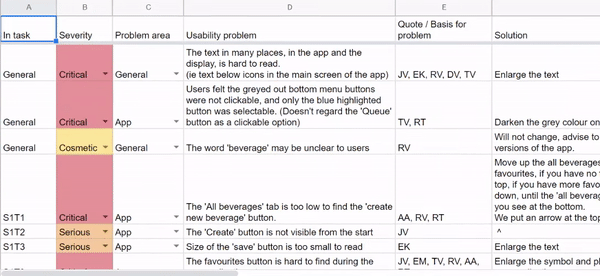
Errors into 3-point severity scale (Critical, Serious, Cosmetic)

SUS Score calculation
Conclusion
We ended the project by providing final solutions for the app, machine, and display to fix the usability issues. Moreover, we discussed future product improvements (e.g., touch-screen, wifi, tutorial, loyalty program, voice assistant).
From this project, I learned how to systematically analyze a product from the machine to the app, and how to validate the new design through structural assessments. Last but not least, we learned as a team how to mentally support each other and adjust to remote work with the 7 hours time difference, since it was a time when we first faced the pandemic.